Splash Media Logo Redesign

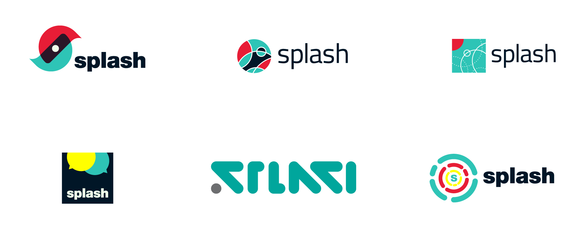
In 2016, Splash Media went through a re-branding. Over the course of three months, I pitched my ideas and concepts for this “New Splash” identity to my Creative Director and the Splash leadership team.
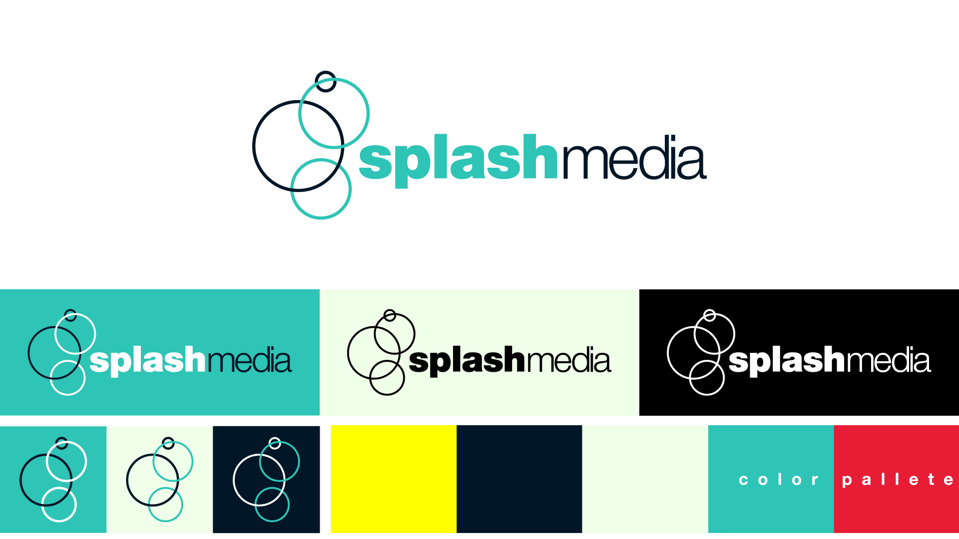
Without going too much into marketing jargon and buzzwords, Splash prides itself on the connections it creates between us and our client. I wanted to incorporate that idea of connections by utilizing intersecting circles, which drove my ideation.
After all this work and concepts, I am very proud of the finished logo (below) that is now being applied to all of Splash Media’s materials.

In the end, my secondary focus (besides updating the icon) was giving Splash a fresher color palette that didn’t look so … “corporate”.
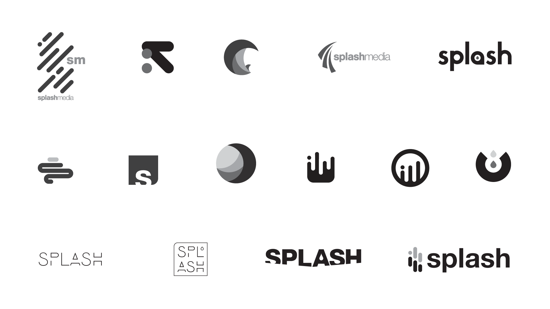
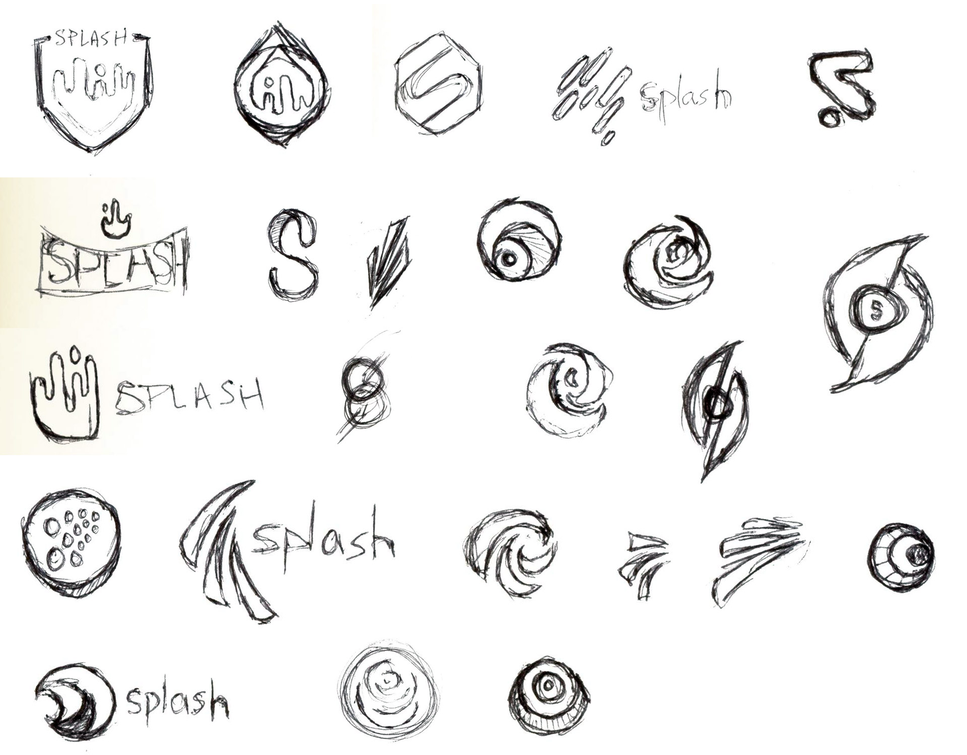
As a bonus, I am also showcasing some of the additional, unused concepts that I came up with (including some random sketches I would do while watching Star Wars and re-runs of Seinfeld) so that you can get a further grasp of my thought process.


